Skills Acquisition
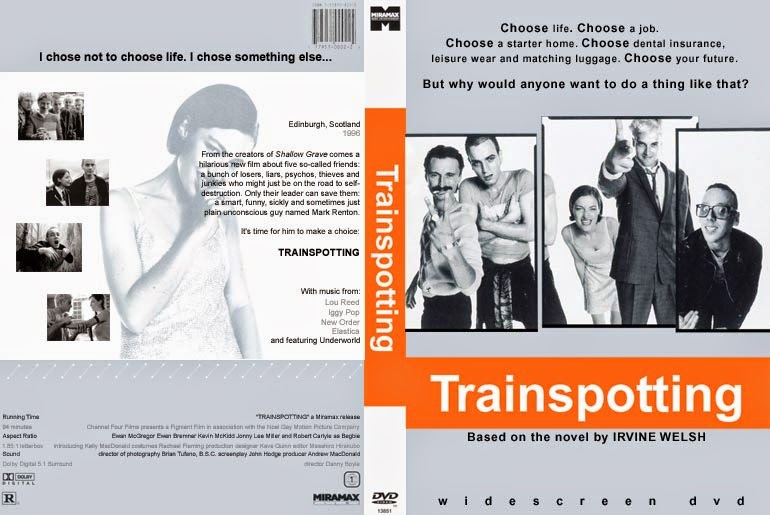
In graphics we learned how to use photoshop and illustrator by going through a tutorial of skin smoothing which is where I put the photo on the first layer and used the spot healing brush tool to remove any spots and freckles, I then created a new layer and put a mask over it which blurs the whole photo, then I used the brush tool to bring back any features that I didn't want blurred. We also learned about screen elimination, this is used by taking a picture of someone or something in front of a green screen and using colour range in photoshop to make the background transparent. We then created an illustrated portrait by using illustrator which is where I took a bitmap image of myself using Photo Booth, then imported it into Adobe Illustrator and used the pen tool to put vectors around each individual feature on the image. I then filled in the sections with colour, this made the image look like a cartoon. By going into more depth and using the pen tool to outline sections such as smile creases, makes the image look more detailed. We then moved on to designing our own DVD cover in Photoshop, I chose to create a slacker movie about drugs.
Graphics
Thursday, 20 November 2014
Tuesday, 21 October 2014
Thursday, 2 October 2014
Proposal for Creative Media Production
Proposal for Creative Media
Production
Format and Medium
It will be an A4 movie poster that will be used as a DVD
sleeve.
Sector
The materials will be used for marketing the film on
magazines, billboards etc.
Working Title
‘Gram’ is the title of the movie because it relates to drugs.
Genre
The genre is Horror/Drama.
Intended Audience and
Age
The audience of my film would be 18+, teenagers because they
are the ones who are interested in drugs.
Summery of Content
Two friends get high and get caught by their parents, the
parents then send the two friends to a specialised rehab centre in a cabin in
the woods away from all civilisation, due to going ‘cold turkey’ the two
friends start to hallucinate and believe the people who are looking after them
are trying to kill them. The two friends then brutally murder all of the
workers and bury them in the forest, when the two friends eventually come
around they realise what they have done and go to where all the drugs have been
confiscated and take them, whilst taking the drugs they go to where they have
previously buried the workers and laugh about how they have failed their jobs.
In the last scene there are police sirens and they are taken away, they then
wake up from the dream. They were high all along, it never happened.
Summary of Style
The movie is about drugs so it will look quite dark and use
dull colours, this will represent the dark turn drugs have. It will have two
girls knocked out on a couch surrounded by needles and bags of powder.
Legal and Ethical Considerations
Don’t use actual drugs.
Copyright.
ASA Codes.
BBFC Classification.
Tuesday, 30 September 2014
Photoshop - Skin Tutorial
After
Here I used an unknown models photo and made her look perfect. I did this by using Photoshop, I put her photo on the first layer and used the spot healing brush tool to remove any spots and freckles, I then created a new layer and put a mask over it which blurs the whole photo, then I used the brush tool to bring back any features that I didn't want blurred.
Friday, 19 September 2014
Film Poster Analysis
The main image of this film poster creates a sinister feel to it, the person behind the glass is peering in somewhere I assume, they shouldn't be looking. This makes the audience want to know what they are looking at, therefore making us want to watch the film. The forest in the background is lit up and is foggy which intrigues the audience.
The title of the film "The Uninvited" draws in the audience's attention as the font is in lowercase, which isn't conventionally normal for a film cover, also the font is fading away which creates a mysterious theme to the film.
The title of the film "The Uninvited" draws in the audience's attention as the font is in lowercase, which isn't conventionally normal for a film cover, also the font is fading away which creates a mysterious theme to the film.
Thursday, 18 September 2014
Adobe Illustrator Animation
This is the animation I made by using Adobe Illustrator.
In this article, I; will explain how to use vector graphics on Adobe Illustrator and bitmap image.
Firstly, I took a bitmap image of myself using Photo Booth, then imported it into Adobe Illustrator and used the pen tool to put vectors around each individual feature on the image. I then filled in the sections with colour, this made the image look like a cartoon. By going into more depth and using the pen tool to outline sections such as smile creases, makes the image look more detailed.
Subscribe to:
Comments (Atom)


